Prose & Poetry
Role: Product Designer
Duration: 2 week sprint
Tools used: Figma, Figjam
Solo Project
The Problem
Prose & Poetry, a beloved neighbourhood bookstore in Highgate, is facing challenges with its online presence. The conversion rate remains low, hindering the potential for online sales.
The solution
Integrating recommendations throughout Olivia's experience, including "You Might Also Like" prompts, to cater to her preference and provide personalized suggestions based on her past purchases.
Creation of a game to unveil "Hidden Gems," inspired by the thrill of discovering treasures in physical bookstores and motivated by its potential to resonate with users during interviews.
Prologue
Prose & Poetry, a beloved neighbourhood bookstore in Highgate, is facing challenges with its online presence. Despite having a website for a year, the conversion rate remains low, hindering the potential for online sales. The goal is to improve the eCommerce platform while preserving the store's unique "small shop" charm and commitment to excellent customer service.
The art of war
Analysing Competitors in the Market
After conducting a comprehensive competitor analysis on Waterstones, bookshop.org, Penguin Book Shop, and World of Books, several strengths and areas for improvement (deltas) have been identified.
Pluses
Simple Top Bar Navigation: All platforms feature a user-friendly top bar navigation system, facilitating easy exploration of various sections of the website.
Write and Check Reviews: Customers across all platforms can conveniently write and check reviews, fostering a sense of community and trust.
Attractive Website: The websites of all competitors are visually appealing, enhancing the overall user experience and encouraging engagement.
Deltas
Order Summary Not Obvious: Some platforms lack clarity regarding the order summary, potentially leading to confusion during checkout.
Glitchy Search Function: Issues with the search function have been noted across multiple platforms, impacting user experience and hindering efficient product discovery.
Best Sellers Below the Fold: Placing best sellers below the fold may result in reduced visibility and potentially lower sales for popular products.
conclusion
In conclusion, this initial competitor analysis serves as a robust foundation for subsequent user research and interview endeavors. Understanding the strengths and weaknesses of key competitors provides valuable insights into industry standards and user expectations, which informed my assumptions for my user research and grounded my interview questions.
The alchemist
Turning insights into gold
My user research focused on understanding the intricate motivations and behaviors behind book purchasing decisions.
Research goals:
To uncover what drives users to buy books.
Where they prefer to make their purchases.
The main obstacles they encounter, and the decision-making process they follow.
Research methods:
5 User Interviews
30 mins
Remote
Documented on Figjam
Screener surveys
research assumptions:
They heavily rely on reviews to guide their book choices.
That they favour independent book sellers for their curated collections.
Analysis:
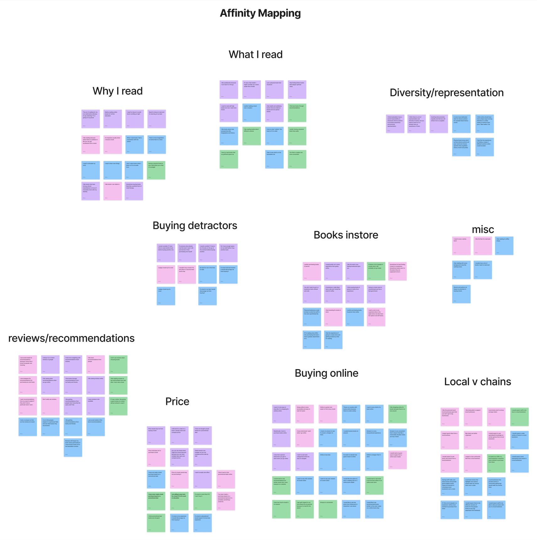
During my interviews, a significant realization came to light: the act of purchasing books is deeply personal. Users express a strong emotional connection to book buying and prefer buying books in person than online. Therefore I knew that there would be heightened expectations for their overall online experience. To further inform my conclusions, I synthesized user sentiments into 'I' statements:
I prefer purchasing books in person because I like the experience of going to a bookstore
I value recommendations from people I respect and trust.
I want to see recommendations for similar books that I have enjoyed
I want to compare prices of books when I shop online.
I expect local bookstores to have knowledgable staff and community events
Olivia in Wonderland
Down the Rabbit Hole to Find the Right Book
By analysing the data, I gained a clearer understanding of the user's identity and motivations, as well as their underlying frustrations.
Olivia
Olivia emerges as a discerning reader who cherishes the tactile experience of browsing through local bookstores and values the personal touch of recommendations from trusted sources. Her love for literature is evident, yet she seeks a personalized approach to explore new releases and discover emerging authors.
Problem Statement:
Olivia needs a way to discover new books from other enthusiasts so that she can feel connected to the reading community.
& So How might we…
…enable Olivia to explore new titles in an interactive manner through curated book recommendations from fellow enthusiasts?
Conclusion
To meet Olivia's desire for personalised exploration of new book releases, we need a solution that taps into her unique preferences and trusted recommendations. By blending technology with community insights, we can craft a platform that delivers Olivia tailored suggestions rooted in her past reading adventures. This ensures every recommendation aligns with her diverse literary palate. Our goal is to empower Olivia to embark on a personalised journey of literary discovery, fostering a genuine sense of connection and authenticity in her book-buying endeavor’s.
Frankenstein of ideas
Crazy 8’s and Sketches
After pinpointing the main issue, I delved into brainstorming potential solutions. Using the "crazy 8’s" method, I started to see how certain ideas could be combined and adapted for different stages of the user journey.
Integrating Recommendations Throughout the Journey:
Given Olivia's strong preference for recommendations, I proposed embedding them throughout her experience, such as with "You Might Also Like" prompts. This approach not only caters to Olivia's desires but also allows for personalized recommendations based on her previous purchases.
Creating a Game to Uncover Hidden Gems:
Although I initially hesitated due to concerns about execution, the concept of a game to discover "Hidden Gems" intrigued me. Inspired by the thrill of finding unexpected treasures in a physical bookstore, this idea aims to recreate that excitement digitally. Despite my initial doubts, I embraced the challenge, motivated by the potential of this solution to capture the essence of book discovery that resonated with users during interviews.
first draft
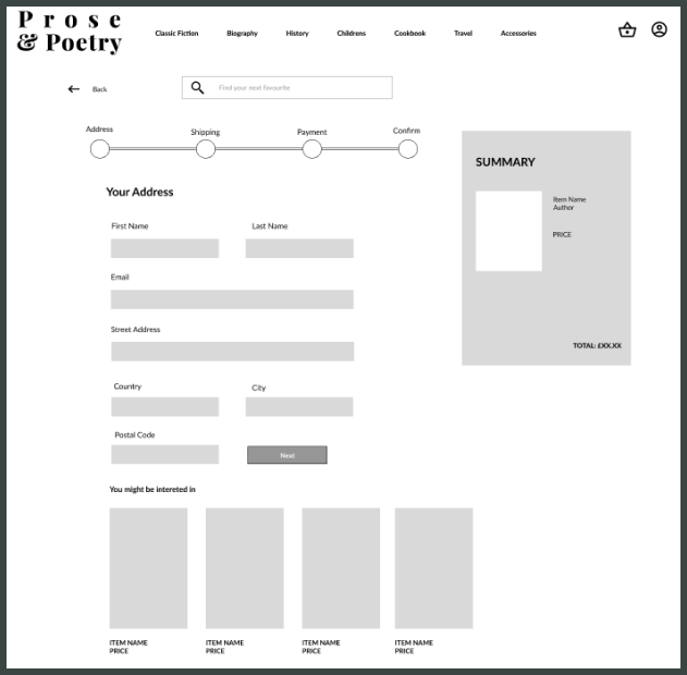
Lo-fi prototype
The Adventures of Design Iterations
Usability tests
Goal:
To observe the usability of the website and the game.
Task:
User is to play the Hidden Gems game and purchase Dr Jekyll and Mr Hyde.
Results:
All users were able to complete the task in the time set. Overall they loved the game and had no issues with it. However, there were a few design details to iterate on.
Iterations
-

[1] Homepage
User felt that the search bar was not in a location they were familiar with on the homepage.
Solution: The search bar was centralised as to adhere to some popular search engines.
-

[2] Recommendations Section
User was confused if they were able to add to basket without leaving checkout page.
Solution: An “Add to basket” button now appears when a user hovers over the product so they are able to quick add to basket.
-

[3] Delivery details
User expected to see an estimated time for delivery.
Theme and mood Exploration
A Cozy Book Nook on the internet
From my user interviews, I gained valuable insights into the emotions tied to purchasing books. One participant, expressed a sentiment that particularly resonated:
“I like the warm cozy feeling bookstores give you.”
This highlighted the significance of ambiance in the book-buying experience. As a result, I focused on infusing my design with a sense of warmth, carefully selecting colors and typography to evoke this feeling.
Last chapter
Final Product
Epilogue
This project hit close to home for me as a self-professed book enthusiast. With a passion for literature and even hosting my own bi-monthly book club, I found myself deeply entrenched in the subject matter. However, I faced the challenge of distancing myself to maintain an impartial perspective in identifying the core problem. Throughout the discovery process I consistently questioned my assumptions, and acknowledged the possibility of bias. By openly admitting my potential predispositions, I approached the project with a critical eye, ensuring objectivity in my analysis.
As a result, I challenged myself personally and pushed my UI abilities in producing a fun interactive game. This endeavor allowed me to expand my skill set while adding a unique and engaging element to the project.
My Work


